Last month I compared and combined three articles on the principles for multimedia instructional videos. One of the common principles was about color use. This month I reviewed over a dozen articles on color use in instruction and found the following:
- Research has found that color can enhance learning retention and transfer. “In the groups where color was used as a learning method, the performance increased by 11 %” (Diachenko et al., 2022).
- Colors have different meanings and invoke different emotions in different countries and cultures (For details on this see Eriksen Translations Inc, 2020; Visual Color Symbolism Chart by Culture, n.d.).
- Color can be used to signal/draw attention, organize similar information, and improve readability. (The use of red in this list draws attention to key words)
- Use colors consistently to indicate links, menus, and titles.
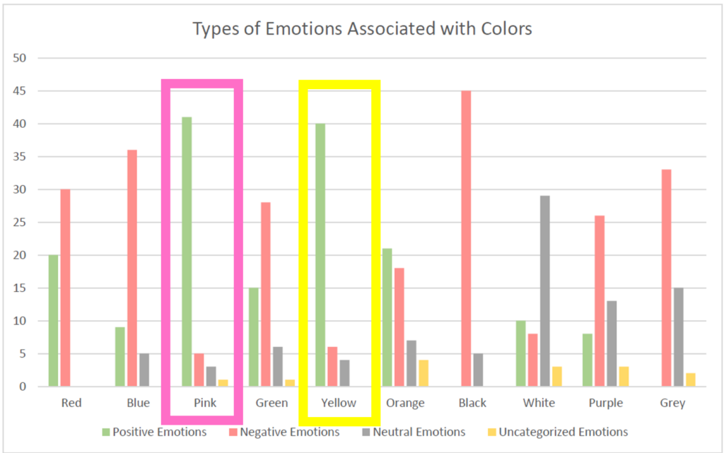
- Use color to indicate the connection between text and a section of a graphic (See examples below).
- Do not use color as the only method for differentiating important information. Also, remember that some students may be color blind, so select colors appropriately.
- Use color sparingly.
According to Misanchuk & Schwier (2009)
The following are extracted from a list of recommendations by Misanchuk & Schwier (2009). I have not included all the recommendations (some were not pertinent to this post, technology has improved color availability, and the article is quite old).
Amount of Colour
- Limit the palette per screen to what the eye can actually keep track of at one glance (usually about six colours, depending on the complexity of the screen design). (Bailey & Milheim, 1991; Baker, 1983; Faiola, 1990; Faiola & DeBloois, 1988; Hoekema, 1983; Milheim & Lavix, 1992; van Nes, 1986).
- Long term users are capable of perceiving and responding to a broader range of colour and coding relationships, so the number of colours used can increase with experience (Faiola, 1990; Faiola & DeBloois, 1988).
- “Material presented in colour is generally processed faster than the same material presented in black-and-white.” (Durrett & Trezona, 1992, p. 16).
- As viewers age, higher levels of brightness are needed to distinguish colours.
Choice of Colour
- In selecting colour combinations, make sure they are compatible (avoid saturated complementary colours such as blue/orange, red./green, violet/yellow) (Bailey & Milheim, 1991; Brockmann, 1991; Durrett & Trezona, 1982; Faiola, 1990; Faiola & DeBloois, 1988; Milheim & Lavix, 1992). Murch (1984) qualified this advice. He argued that opponent colours, especially desaturated colours, can go well together for simple colour displays.
- Avoid background colours too high in brightness and saturation (Bailey & Milheim, 1991; Faiola, 1990; Faiola & DeBloois, 1988; Horton, 1991; Milheim & Lavix, 1992).
Coding/Cueing with Colour
- Colour coding can link logically related data; differentiate between required and optional data; highlight errors; and separate prompts, commands, and other elements in the interface (Adkins & Pease, 1991; Rambally & Rambally, 1987).
- Choose distinctive hue, brightness, and saturation differences for discrimination among major items. Poor colour memory may be overcome by carefully using colour to enhance discrimination (Faiola, 1990; Faiola & DeBloois, 1988).
Example of Connections with Color
The following text and graphic are an example of Connections between text and graphics.
In a research project by West & Silberman (2020), pink and yellow were associated with positive emotions more than any other colors. Note, however, that the study subjects were 48 high school students from an unspecified country. Also note difficulties when trying to read pink and yellow. The students were asked “What color do you think of when you think of these emotions?”
(For 3 additional examples, skip to here)

Selected References
- Diachenko, I., Kalishchuk, S., Zhylin, M., Kyyko, A., & Volkova, Y. (2022). Color education: A study on methods of influence on memory. Heliyon, 8(11), e11607. https://doi.org/10.1016/j.heliyon.2022.e11607
- Eriksen Translations Inc. (2020, February 3). How Color Is Perceived by Different Cultures | Eriksen Translations. Eriksen Translations Inc. https://eriksen.com/marketing/color_culture/
- Misanchuk, E., & Schwier, R. (2009). The Mythology of Colour in Multimedia Screen Design: Art, Science, and Connoisseurship. Canadian Journal of Learning and Technology / La Revue Canadienne de l’apprentissage et de La Technologie, 24. https://doi.org/10.21432/T23W4D
- Morita, A., & Kambara, T. (2021). Bizarreness and Typicality Effects of Color on Object Recognition Memory. Perceptual and Motor Skills, 128(6), 2469–2489. https://doi.org/10.1177/00315125211048391
- Ozcelik, E., Karakus, T., Kursun, E., & Cagiltay, K. (2009). An eye-tracking study of how color coding affects multimedia learning. Computers & Education, 53(2), 445–453. https://doi.org/10.1016/j.compedu.2009.03.002
- Schaeffer, R. S., & Bateman, W. (1996). So Many Colors, So Many Choices: The Use of Color in Instructional Multimedia Products. https://eric.ed.gov/?id=ED397835
- Visual Color Symbolism Chart by Culture. (n.d.). ThoughtCo. Retrieved October 21, 2024, from https://www.thoughtco.com/visual-color-symbolism-chart-by-culture-4062177
- Wang, X., Mayer, R. E., Han, M., & Zhang, L. (2023). Two Emotional Design Features Are More Effective Than One in Multimedia Learning. Journal of Educational Computing Research, 60(8), 1991–2014. https://doi.org/10.1177/07356331221090845
- West, B., & Silberman, J. (2020). A Colorful Impact: The Psychological Impact of Colors. Journal of Student Research, 8(2). https://doi.org/10.47611/jsrhs.v8i2.1287
- Wong, R. M., & Adesope, O. O. (2021). Meta-Analysis of Emotional Designs in Multimedia Learning: A Replication and Extension Study. Educational Psychology Review, 33(2), 357–385. https://doi.org/10.1007/s10648-020-09545-x
Additional Examples
The following are the same text and graphic, but with spacing and color changes.
Connections with Color – 1
Note how removing the text color means the reader may take longer to make the association. The eye is not drawn between the corresponding text and graphic as much.
EXAMPLE WITHOUT COLORED TEXT:
In a research project by West & Silberman (2020), pink and yellow were associated with positive emotions more than any other colors. Note, however, that the study subjects were 48 high school students from an unspecified country. Also note difficulties when trying to read pink and yellow. The students were asked “What color do you think of when you think of these emotions?”

Additional Example of Connections with Color – 2
But placement is also important. Note how moving the graphic further from the corresponding text means the reader may take longer to make the association.
EXAMPLE WITH COLORED BUT SEPARATED TEXT:
In a research project by West & Silberman (2020), pink and yellow were associated with positive emotions more than any other colors. Note, however, that the study subjects were 48 high school students from an unspecified country. Also note difficulties when trying to read pink and yellow. The students were asked “What color do you think of when you think of these emotions?”
IGNORE THIS Lorem ipsum dolor sit amet, consectetur adipiscing elit. Cras magna enim, convallis a lectus at, volutpat pretium ipsum. Nulla tempus euismod magna a lacinia. Lorem ipsum dolor sit amet, consectetur adipiscing elit. Cras magna enim, convallis a lectus at, volutpat pretium ipsum. Nulla tempus euismod magna a lacinia. Lorem ipsum dolor sit amet, consectetur adipiscing elit. Cras magna enim, convallis a lectus at, volutpat pretium ipsum. Nulla tempus euismod magna a lacinia.
IGNORE THIS Lorem ipsum dolor sit amet, consectetur adipiscing elit. Cras magna enim, convallis a lectus at, volutpat pretium ipsum. Nulla tempus euismod magna a lacinia. Lorem ipsum dolor sit amet, consectetur adipiscing elit. Cras magna enim, convallis a lectus at, volutpat pretium ipsum. Nulla tempus euismod magna a lacinia. Lorem ipsum dolor sit amet, consectetur adipiscing elit. Cras magna enim, convallis a lectus at, volutpat pretium ipsum. Nulla tempus euismod magna a lacinia.
IGNORE THIS Lorem ipsum dolor sit amet, consectetur adipiscing elit. Cras magna enim, convallis a lectus at, volutpat pretium ipsum. Nulla tempus euismod magna a lacinia. Lorem ipsum dolor sit amet, consectetur adipiscing elit. Cras magna enim, convallis a lectus at, volutpat pretium ipsum. Nulla tempus euismod magna a lacinia. Lorem ipsum dolor sit amet, consectetur adipiscing elit. Cras magna enim, convallis a lectus at, volutpat pretium ipsum. Nulla tempus euismod magna a lacinia.

Additional Example of Connections with Color – 3
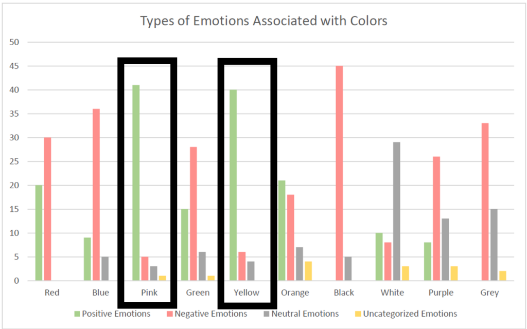
And this example removes the color from the graphic. Now the eye does not make the automatic connection between the text and graphic.
In a research project by West & Silberman (2020), pink and yellow were associated with positive emotions more than any other colors. Note, however, that the study subjects were 48 high school students from an unspecified country. Also note difficulties when trying to read pink and yellow. The students were asked “What color do you think of when you think of these emotions?”

